Timeline of human history, version 2
Frequently asked questions...
What is the purpose of this timeline?
The most obvious purpose of the timeline is to present historical data of all kinds is an easily accessible and somewhat expressive format. A more fundamental purpose is to confront the reader with a clear consciousness of how much time has in fact passed, and how small and insignificant a part of all this time is taken up by even the grandest and most long-lasting human endeavours. I feel a need to spread the word - to scientists, politicians, the general public - of our smallness, our total insignificance, and consequently our need to reverently respect the vast powers of the natural world that surround us on all sides.
How do I navigate the timeline?
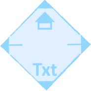
Each timeline has a pale yellow field on its right side - the side of the present. This field will be enlarged to fill the entire screen when you go to the next timeline. Up in the top right-hand corner of the screen you will find a blue diamond shape:
Click on the left arrow to go back a timeline, click on the right arrow to go to the next timeline, click on the little house at the top to go the the timeline's homepage, and click on the text at the bottom to read about the timeline being displayed. The timelines themselves are not clickable.
How do I interpret the color coding?
The color coding used in the timelines aims first and foremost to keep things separate. Thus, the various geological epochs have different colors, just to make them different. At the same time, a certain, not wholly consistent, meaning has been been assigned to some colors. Most prominently, green is often associated with (biological) life, red with heat and thus with civilization, orange and red with warm weather, blue with cold and ice, black with war, epidemics, machines, etc. I find that the color coding is most useful if one does not try to make too much sense of it.
What are the limitations of this timeline?
The timeline is more of an artistic than a scientific work. It offers no data that are not already well known. It's only claim to originality is the way the data have been aranged. There are no doubt countless omissions, inaccuracies and errors, and readers are therefore discouraged from using the timeline as a source (e.g. for history papers).
What sources have I used to compile the timeline?
The main source for the timeline has been Wikipedia (hundreds of articles, mainly from the English edition). In addition, I have used on- and offline sources of various kinds that more or less happened to pass through my hands. The details on apes' movements between Africa and Europe (timeline 7) thus derive from an article in (I think) a New Yorker I happened across at my mother's place. The climate graphics integrated into timelines 9-15 have been adapted from graphs from reputable sources on the net.
What are my further plans for the timeline?
The timeline has now been published in its second edition. No third edition is contemplated. However, minor changes and adjustments may occur. I also hope to be able to add additional timelines to the 16 now offered. My temporary plan is to add three new timelines, focused on the last 200 years (since Napoleon), the last 70 years (since Hitler), and the last 20 years.
How does one offer suggestions for improvements?
Suggestions for improvements should be sent to my contact address.